Overview
Choosing a new mattress can be daunting, especially when online tools feel disconnected from the in-store experience. This project, conducted in collaboration with IKEA, set out to bridge that gap and build trust in the digital comfort planning process.
The Challenge
Users lacked trust in IKEA's comfort planning tool, finding it detached from the physical shopping experience. Our goal was to create a more integrated, trustworthy, and user-friendly tool that would support customers both online and in-store.
The Solution
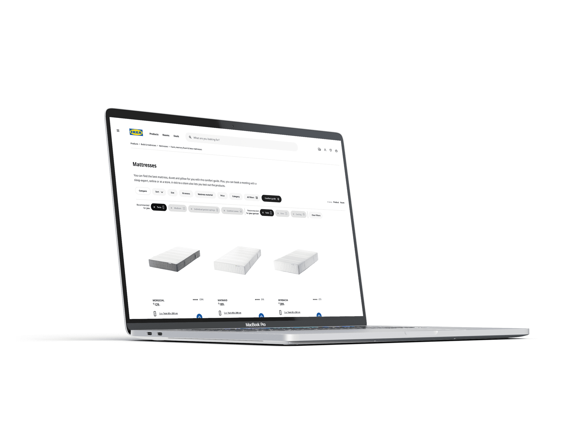
We proposed an integrated comfort planning tool that brings together the digital and physical shopping journeys. The redesigned interface features two main sections: an interactive Q&A area and a results panel that transparently shows recommendations and sorting logic. Key features include:
- In-store tags mirrored online for recognition and trust
- An integrated chatbot for real-time support
- A detailed sorting and tag system for intuitive product discovery
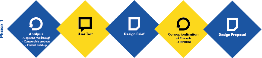
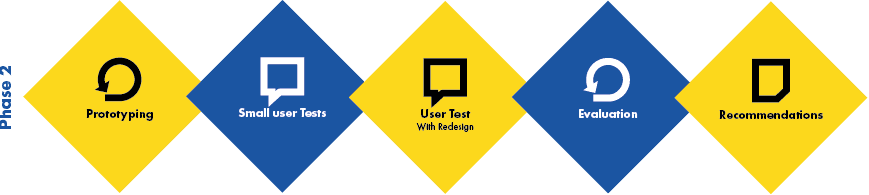
Research & Design Process
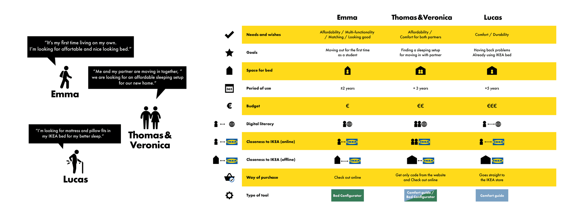
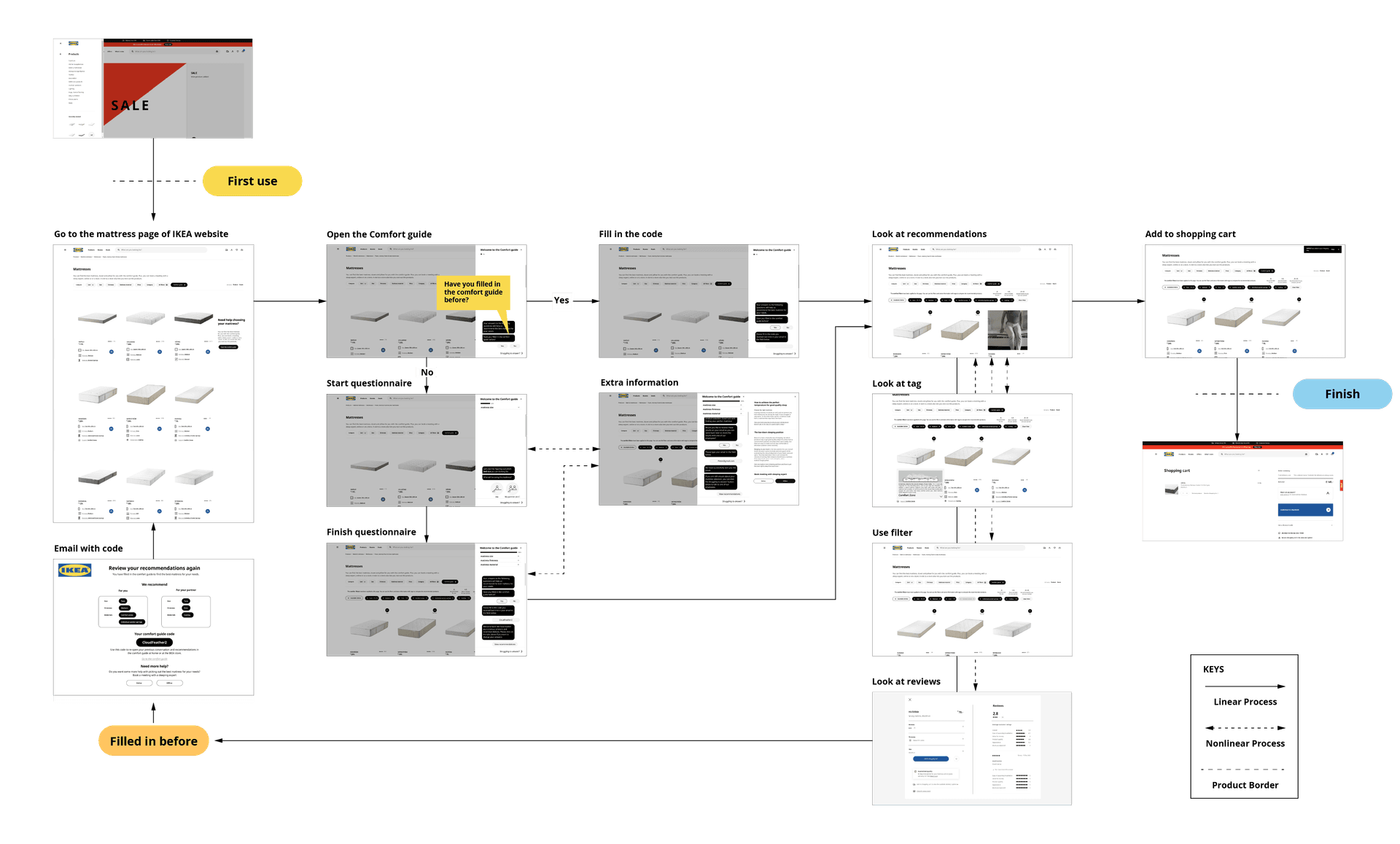
The project began with a thorough product evaluation, including cognitive walkthroughs, competitor analysis, and persona development. We mapped out the user journey and identified pain points through:
- Qualitative user testing
- Paper wireframing and iterative digital prototyping in Figma
- Multiple design sprints, each refining the user experience
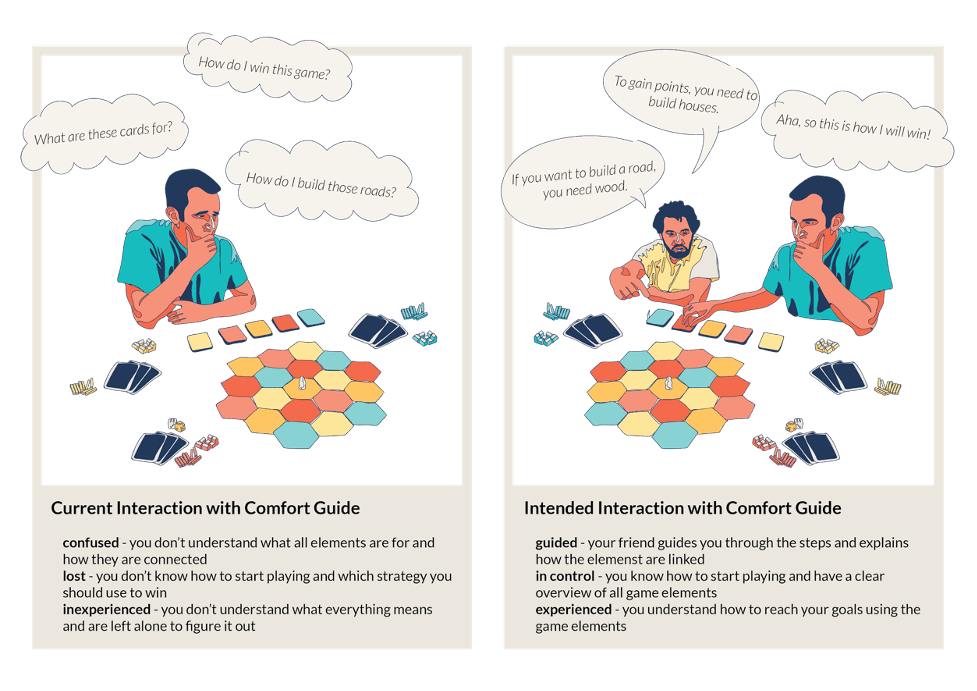
Interaction Vision
The current interaction with the product feels like trying to play a board game without having read the manual. You are left on your own to figure out what all the game elements are for and how to use them to reach the end of the game. We want to make the interaction with our redesign feel like having a friend introduce you to a new board game. It should feel guided, trustworthy, patient, and fun.
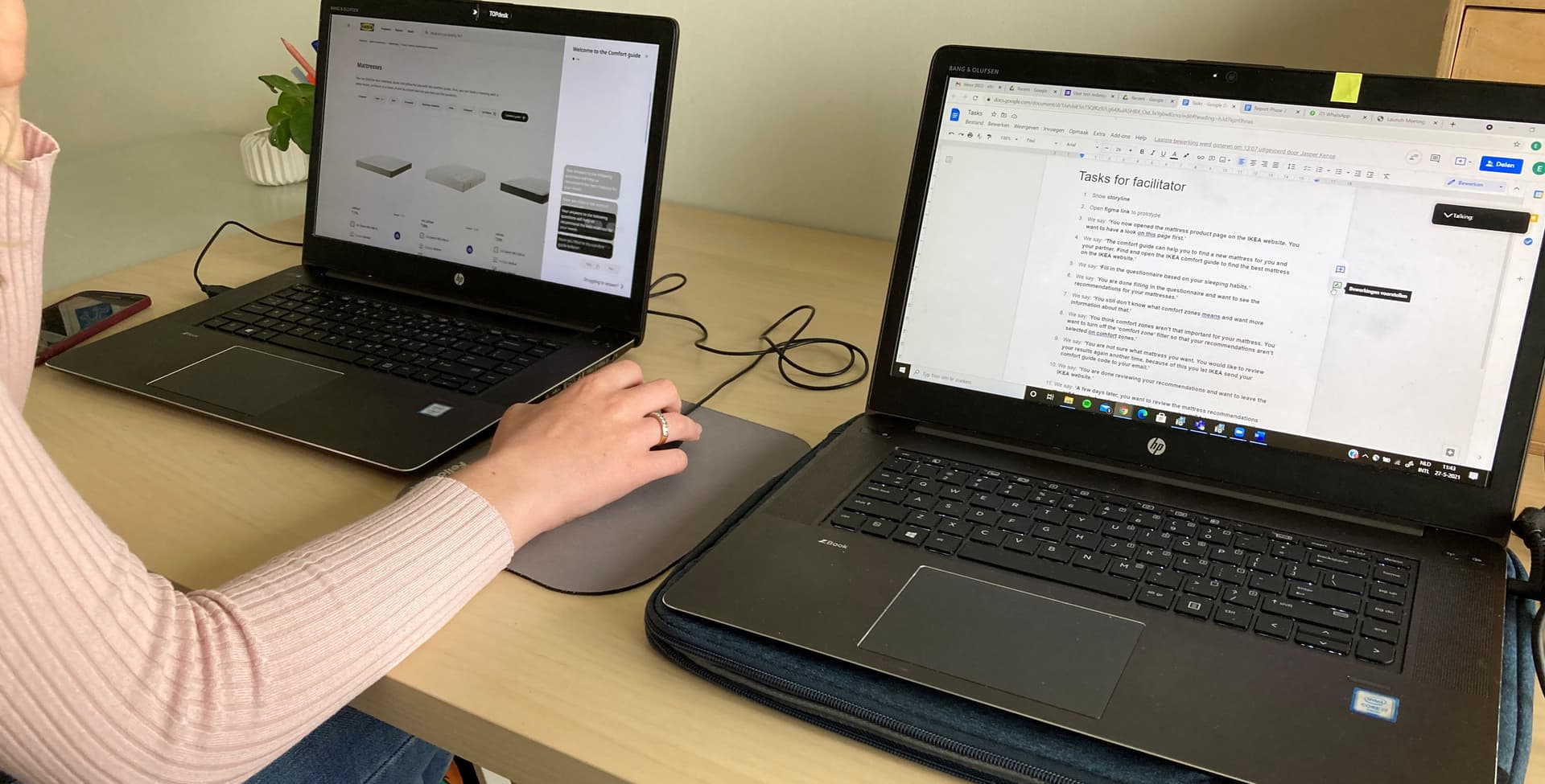
User Testing
A comprehensive test plan was developed and piloted, leading to a final round of user testing. Sessions were conducted in a home environment, with facilitators guiding participants and note-takers observing remotely. The results were compared to the original tool, showing clear improvements in trust and usability.
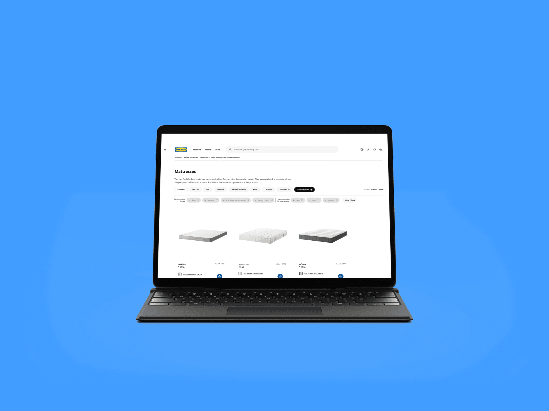
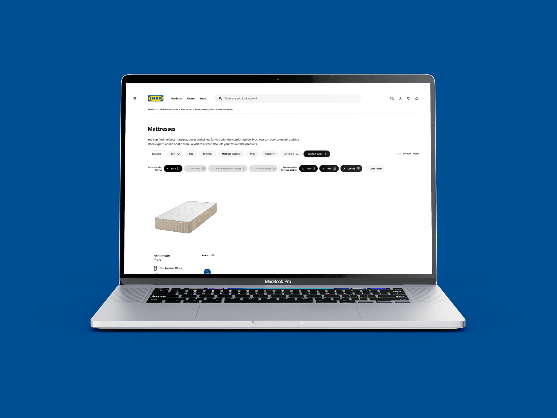
Final Design
The interface is divided into two sections:
- The left section presents the interaction between the system and users
- The right section shows the results, displaying the sorting process and recommendations

Key Features
-
Integrated Q&A System
-
Real-time Recommendations
-
Tag-based Navigation
-
Product Comparison
-
Interactive Elements
Impact & Learnings
While it's uncertain how many of our recommendations were directly implemented, several design decisions appeared in IKEA's live and test environments. The project demonstrated the value of integrating digital and physical experiences and highlighted the importance of user-centered design and iterative testing.
