The problem
The old marketing site had drifted into a pretty common legacy problem. The content was stale, the structure was hard to maintain, and sales and support kept getting pulled in to explain things the website should have handled on its own. Internal teams were spending time on questions that should have been answered by better navigation, better copy, and a better page structure.
At the same time, coeo was trying to present a clearer commercial story without losing the practical tone that made the company work. That is usually where design either earns its keep or gets reduced to polish. I wanted this project to prove the first one.
Why I cared
This was a good chance to show that design can do real work in a business context. If I could turn a messy, overworked site into something sales could trust, internal teams could maintain, and prospects could actually move through, that would save people time in the day-to-day. That matters more than a nice-looking homepage.
Kickoff
The project started with coeo's marketing lead, one person who owned the day-to-day content, and an external partner on implementation. I stayed close to all three, because the work only made sense if we kept strategy, content, and build decisions in the same conversation.
The early discussion was straightforward:
- The site needed to explain the service without overselling it.
- Different sectors needed different entry points.
- The content had to work for both prospective clients and people in debt.
- The build had to stay maintainable for a small team.
The priorities
I turned those kickoff conversations into a small set of priorities I could actually design against:
- Make the value proposition obvious in a few seconds.
- Give each sector its own route through the site.
- Keep the structure simple enough for the team to update.
- Reuse a shared system instead of inventing a new page pattern every time.
- Make support and debtor information easy to find without burying it in marketing language.
That list became the filter for most of the design decisions that followed.
What each audience needed
The site had to serve a few different groups without turning into a pile of tailored one-offs.
- Prospective clients in sectors like e-commerce, utility, and hosting needed proof that coeo understood their operating reality.
- People in debt needed a direct path to support and payment help, not a soft marketing page that made them hunt around.
- Partners and support organizations needed enough clarity to understand how coeo works and where to route people.
- Sales and internal teams needed a structure they could point to instead of explaining the same things over and over.
That is the part where the scope could have exploded. It did not, because we kept forcing each audience question back to intent: what do they need next, and what page should answer that?
Sector pages
The sector pages carried most of the commercial weight. Each one needed a slightly different emphasis, but all three still had to sit inside the same system so the team could maintain them without creating three separate sites.
E-commerce
For e-commerce, I focused on clarity, trust, and conversion routes. The page had to show that coeo understood high-volume, transaction-heavy environments and could communicate that without overexplaining it.
Utility
The utility page needed to feel dependable and operationally clear. I kept the structure direct so visitors could quickly see the service model, the practical context, and the next step.
Hosting
The hosting page leaned more into technical credibility. It needed to signal reliability, security, and clear support without losing the same visual system used across the rest of the site.
Leading implementation
I was not just handing over designs. I led the implementation effort with developers in two-week sprints, which meant turning design decisions into buildable work, keeping the backlog clear, and making sure the site kept moving while security updates were being implemented.
That also meant owning a lot of the practical coordination around the build:
- translating stakeholder feedback into sprint-ready tasks
- building the pages and checking how they held up in the real site
- setting up and working across approval, staging, and dev environments
- testing my own changes before they moved forward
- keeping sprint direction focused so the team could ship without churn
Working that way avoided the usual design handoff problem. I stayed close to the implementation detail, so if a pattern did not work in code, we could adjust it early instead of discovering it after the fact.
The roughest tradeoff was that not every stakeholder wanted the same thing.
- Sales wanted stronger proof and faster conversion routes.
- Marketing wanted room to tell the broader brand story.
- Engineering wanted a layout system they could reuse without custom work everywhere.
My job was to keep those needs in view without letting the site turn into a compromise soup.
Navigation around intent
I did not organize the site around internal teams or company departments. I organized it around what people were actually trying to do.
Most visitors were there to do one of a few things:
- Understand what coeo does.
- Check whether coeo fits their sector.
- Find support or debtor information.
- Contact the right team without a long detour.
That changed the navigation from internal language to user intent. It sounds small, but it is the difference between a site that reflects the company and a site that helps people get somewhere.
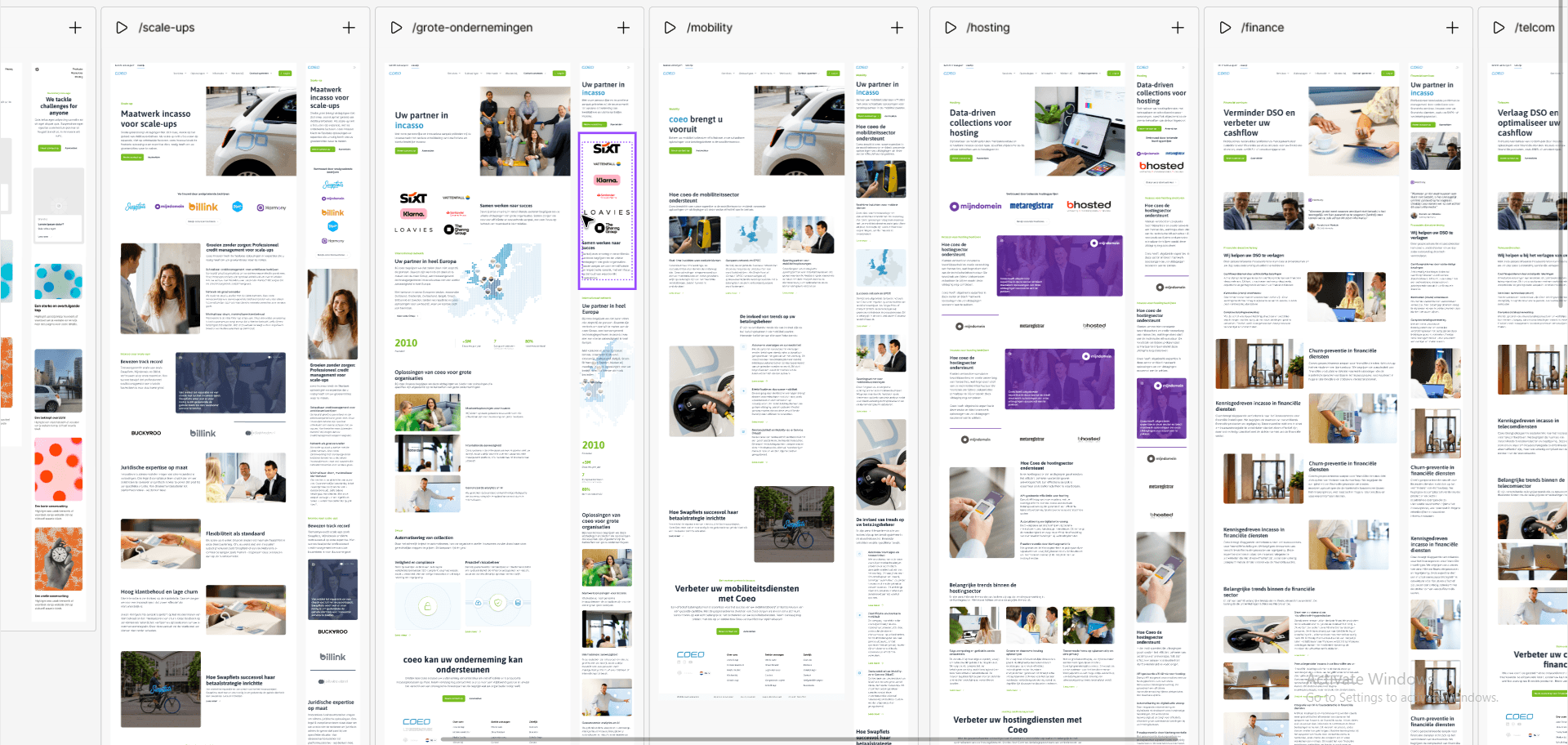
Overview first, depth second
The homepage worked like a dashboard for the site. It had to give people a quick read on who coeo is, which sectors it serves, and where to go next. Once that was clear, the deeper pages could do the heavier lifting.
That structure mattered because different visitors arrived with different levels of context.
- New visitors needed orientation first.
- Experienced buyers needed the detailed sector proof faster.
- Internal teams needed a predictable layout they could extend.
So the page hierarchy followed a simple rule: overview at the top, detail lower down, and no dead ends in between.
Supporting different expertise levels
Some people came in with almost no context. Others already understood the sector and wanted the specifics.
I designed for both.
For lighter readers, the site needed clean entry points, short explanations, and obvious next steps. For more advanced users, it needed enough detail to answer real commercial questions without forcing them to call someone. That meant tightening the wording, keeping the hierarchy obvious, and making sure the sector pages could go deeper without feeling cluttered.
The same logic helped with debtor-facing content. If someone was already stressed, the site could not ask them to decode marketing language first. The route to help had to stay obvious.
Technical thinking
I made a point of keeping the system friendly to engineering.
The big design-system decision was to stick to a small set of repeatable patterns: consistent hero sections, predictable content blocks, stable CTA treatment, and a limited set of layout variations. That made the WordPress build easier to assemble and easier to maintain after launch.
I also avoided custom patterns that would only solve one page. If a special treatment did not earn its keep across the rest of the site, I cut it. That saved time in the build and reduced the risk of the content team inheriting something they could not safely update.
The workflow choice mattered too. We kept validating page structure while the build was moving, which meant fewer late surprises and fewer rounds of rework at the end.
Outcome
The redesign gave coeo a clearer site structure, a more consistent design system, and a better foundation for future content. Sales no longer had to carry as much of the explanation burden. Internal teams got a site that was easier to maintain. Visitors got a simpler path to the right information.
The work shipped in a way that leaves room for iteration, which is how it should be. The main structure is in place, and future changes can build on the same system instead of starting again from scratch.