The payment portal at coeo had become a high-friction part of the customer experience. It asked people to deal with debt, legal language, and time pressure through an interface that offered very little clarity or support. Management already knew the portal needed work, but my thesis research made the problem harder to ignore: many debtors using the wider service were also dealing with accessibility barriers such as low literacy, limited financial literacy, language barriers, or cognitive strain.
I led the redesign of the portal with a simple goal: make it easier for people to understand their situation, take the next step, and get help when they needed it. That meant improving the interface, but it also meant redesigning the broader flow around payment, objection, support, and communication. The project sat at the intersection of UX, accessibility, service design, legal constraints, and operational realities.
The challenge was not just to make the portal look better. It had to reduce support pressure on operations, stay compliant with legal and privacy requirements, and work for users in vulnerable situations who often arrived stressed, confused, or ashamed. The existing portal acted like a barrier. I wanted the new one to feel more like guidance.
Understanding the problem
A key part of the project was recognizing that this was not a standard optimization exercise. The user group was unusually sensitive. Many people using the portal were already under financial stress, and some also had trouble reading complex text, understanding formal financial language, or navigating digital systems confidently.
That changed how I approached the work. Rather than starting from interface patterns or business goals alone, I treated comprehension and emotional load as core design constraints. The portal needed to lower cognitive effort, make choices legible, and avoid making people feel trapped or punished by the experience.
At the same time, there was a clear operational incentive. Support teams were spending time on calls that often came down to poor interface clarity rather than complex case handling. If the portal could help users resolve simple tasks on their own, it would improve both the customer experience and the efficiency of the service behind it.
Co-creating with vulnerable users
One of the most important parts of the project was getting out of the office and talking directly to people who had experience with debt. That was not easy. Debt is personal, and recruiting participants willing to discuss it openly is difficult. It became even harder when trying to include people with literacy, language, or cognitive challenges.
Eventually I found a group of participants who were willing to reflect on their experiences and help shape a better portal. In co-creation sessions, we reviewed the existing experience together and talked honestly about what made it hard to use. Those sessions gave the project a much stronger foundation than internal assumptions ever could.
A few design principles became clear very quickly. The portal needed to use B1-level language. It needed to reduce cognitive load rather than front-load information. It needed large, simple, obvious interaction points. And it needed stronger self-service, because many users were reluctant to call for help even when they needed it.
Research across the organization
This project also required a lot of internal alignment. The portal sat in the middle of a larger organizational system, so I mapped the internal stakeholders affected by it and worked closely with each group.
Operations helped me understand the day-to-day failures in the existing journey: where users got stuck, where errors occurred, and why so many calls came in. Customer support added another layer by showing how emotional the experience often was. Users were not just confused. They were often anxious before they even started.
The legal team was a critical partner throughout the project. Debt collection interfaces carry strict requirements around compliance, privacy, and communication. I worked closely with legal to separate what was actually required from what had simply become institutional habit over time. That distinction mattered. It created room to simplify language and structure without compromising compliance.
Leadership, marketing, and sales were also part of the process. Leadership needed confidence that the redesign addressed both user needs and business goals. Marketing and sales saw the portal as part of the broader value proposition of the service. My role was to keep the project grounded in user evidence while building enough cross-functional trust to move it forward.
Designing the service, not just the screens
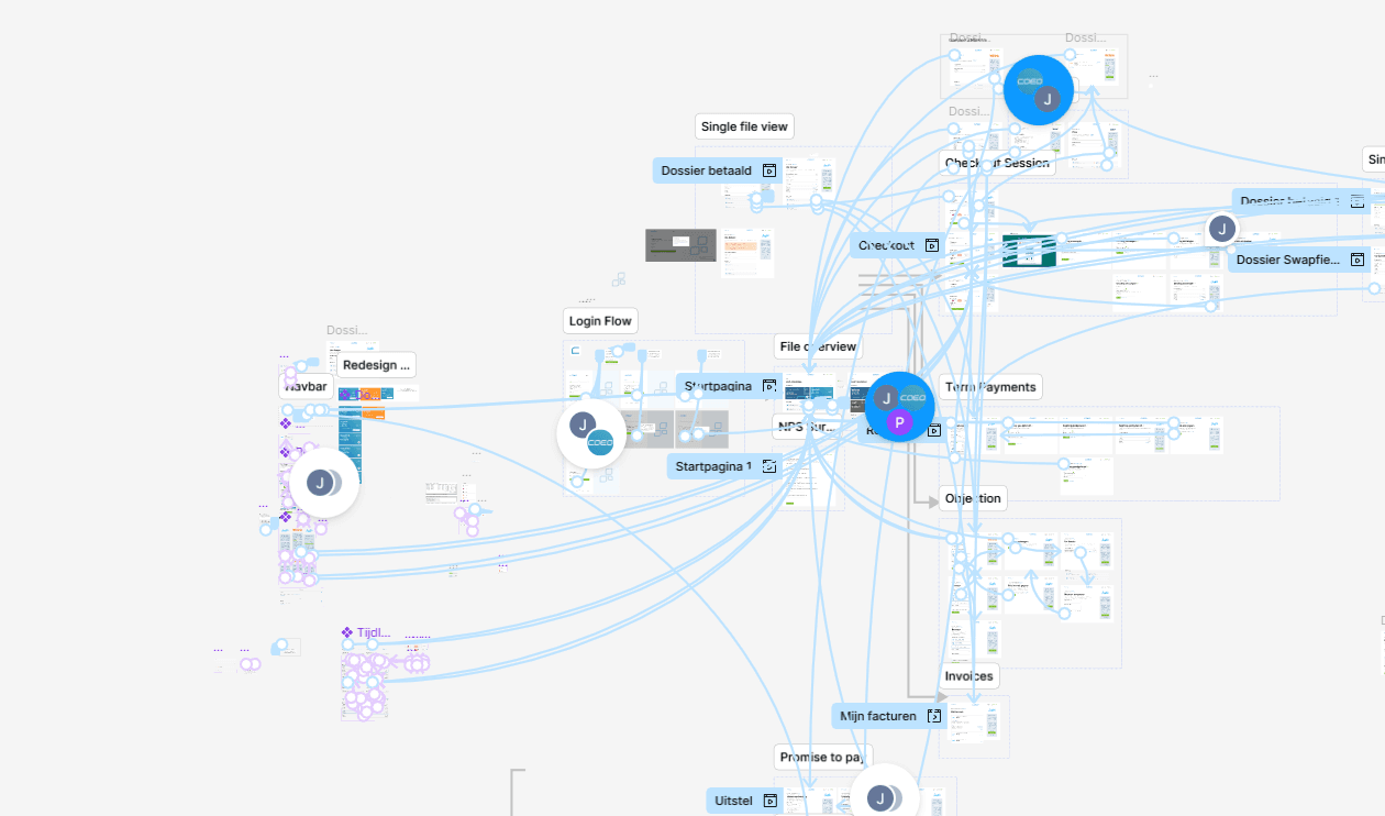
The early output of the project was not a polished UI. It was a shared model of the experience: design principles, flow maps, and a clearer understanding of the decision points users had to navigate. I used Figma as a collaboration space, but the real work was in translating a messy, high-stakes service into something users could move through with less friction.
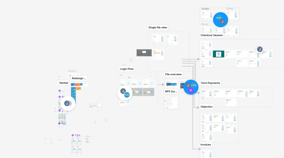
This was a systems problem as much as a visual one. Users needed different paths depending on their situation, but the portal could not overwhelm them with too many options at once. I focused on creating a clearer information hierarchy and a smaller set of distinct jobs to be done: pay now, arrange a payment plan, dispute the debt, or get help.
That framing helped the whole team. It made the product easier to explain internally, easier to prototype, and easier to validate with users.
Prototyping and iteration
I worked iteratively, starting with low-fidelity wireframes and flow sketches before moving into higher-fidelity prototypes. The early prototypes were useful for pressure-testing logic and information architecture with internal teams. Weekly reviews with legal, operations, IT, marketing, and sales helped surface edge cases and constraints early.
Once the flow structure held up, I refined the interface itself. That meant a lot of attention to spacing, button size, copy, contrast, form behavior, and feedback states. In this project, visual design decisions were tightly connected to accessibility and comprehension. The goal was not polish for its own sake. It was to make each step feel more understandable and less intimidating.
Testing and iteration continued throughout the process. When a label was unclear, I changed it. When an explanation still felt too abstract, I rewrote it. When a user hesitated, I looked at whether the interface was asking too much of them at that moment. That mindset shaped the project more than any single feature did.
The key product decisions
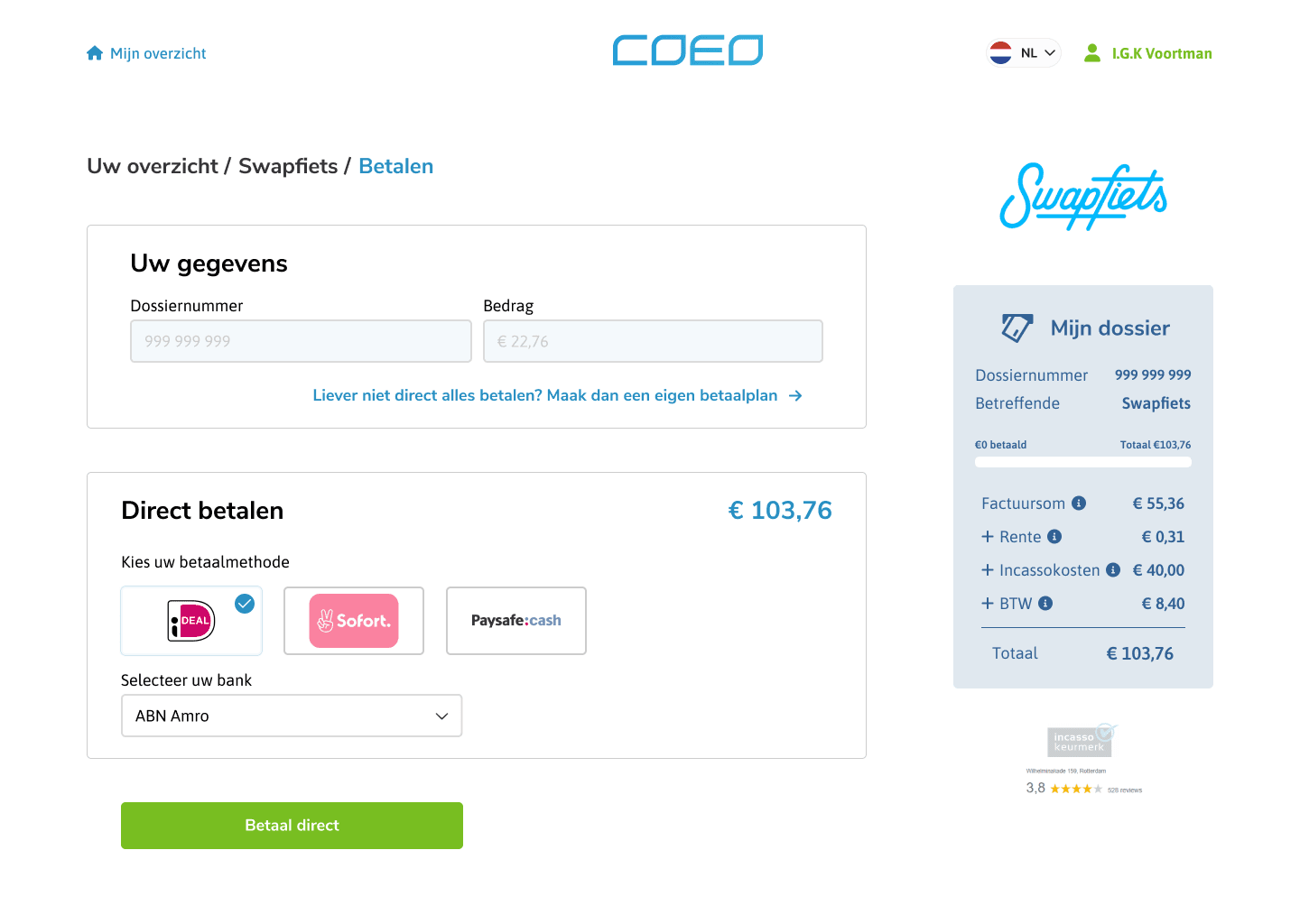
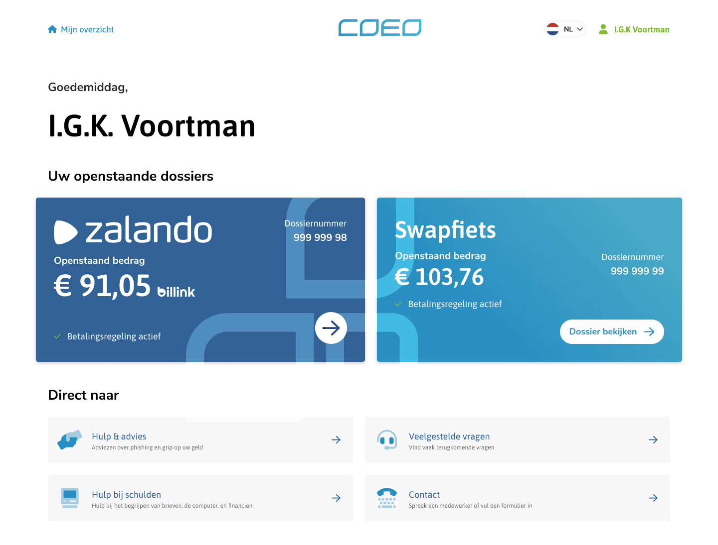
The final portal was built around a few core use cases: immediate payment, payment plans, objections, and support. What mattered most was that each flow felt explicit and navigable.
The payment plan flow became one of the most important journeys. Rather than forcing users into a rigid, opaque process, I designed it as a guided sequence. Users first checked eligibility through a simple questionnaire, then explored their options through a plan calculator, reviewed the consequences, and confirmed the result. The ambition was to make payment plans feel understandable and adjustable rather than imposed.
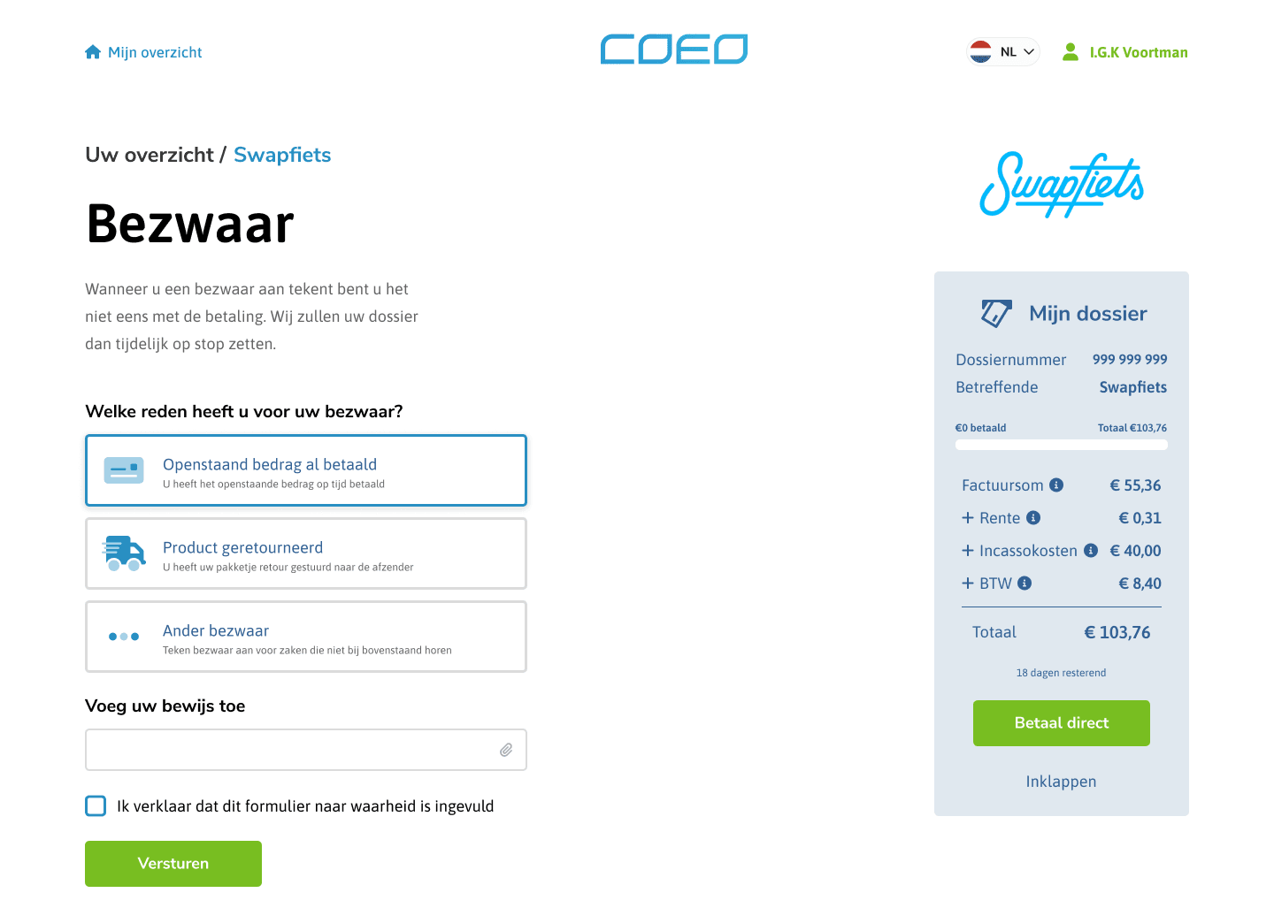
The objection flow followed the same principle. Instead of legal jargon and unclear consequences, I designed a step-by-step route that explained rights, process, and expectations in plain language. This gave users a fairer, more legible path through a stressful task.
Support was not treated as a separate destination. I integrated support hooks directly into the experience through contextual help, persistent access points, and clear signposting to debt assistance services. That was an important shift. Help no longer appeared as a last resort after failure. It became part of the intended experience.
I also designed a clearer case overview so users could understand their current debt amount, payment history, upcoming deadlines, and next actions without digging through fragmented information. That overview functioned as a status layer for the whole portal, helping users orient themselves quickly.
Accessibility as a design requirement
Accessibility was not a checklist applied at the end. It was one of the main reasons the redesign existed in the first place. I worked toward WCAG 2.1 AA compliance and treated readability, navigation, and error handling as core design responsibilities.
That included stronger contrast, larger interactive elements, clearer focus states, semantic structure, better form feedback, and support for keyboard and screen reader use. But accessibility in this project went beyond technical compliance. It also meant reducing ambiguity, lowering reading complexity, and using visual hierarchy to support understanding.
A good example was the iconography system. I did not want icons to serve as decoration or visual filler. They had to communicate reliably, especially for users with low literacy or language barriers. I tested icon choices with users and found that several icons that felt obvious to designers were not obvious at all in practice. That forced me to simplify and standardize the system much more rigorously.
Testing with real users
To validate the redesign properly, I partnered with MEE Rotterdam Rijnmond to test with vulnerable groups. This was a crucial part of the project. Without it, we would have risked designing for a theoretical user rather than the real people most affected by the service.
The test group included people with intellectual disabilities, low literacy, limited digital experience, language barriers, and high financial stress. I ran one-on-one usability sessions and paid close attention not just to whether users could complete tasks, but how they understood what was happening.
The sessions surfaced several important issues. Some language was still too complex even after simplification. The first version of the payment plan calculator asked too much of users too quickly. Several people needed more reassurance during the process, and some benefited from slower pacing and stronger confirmation states.
Those findings led to another round of iteration. I simplified language further, increased spacing, made action areas more prominent, improved progress feedback, and introduced ways to pause and return later. That last point mattered especially because some users needed time to process information before committing to a decision.
Working closely with development
Although my primary role on this project was design and project leadership, I stayed involved during implementation rather than treating design as a handoff. That was important because many of the hardest decisions only became visible once the flows met real system constraints.
I worked closely with developers to refine the experience during build. When a pattern did not behave as expected in the production environment, we redesigned it together. When accessibility required more than a visual fix, we checked how it held up in code. When performance or technical limitations threatened usability, I helped find alternatives that preserved the intent of the design.
This was especially visible in areas like the payment plan calculator, form validation, and mobile behavior. The live implementation revealed issues that static prototypes could not. Staying close to development helped ensure that the final portal was not just well designed in Figma, but actually usable in the shipped product.
Impact
The redesign improved the portal in two directions at once. For users, it reduced friction and improved comprehension. For the organization, it created a clearer self-service experience that reduced unnecessary support demand.
I do not have public metrics to share, but the qualitative impact was strong. Users were better able to understand their situation and complete the intended task. Support pathways were more visible. Payment plan setup became more approachable. Internal teams also reported that the new design created fewer avoidable questions and fewer errors caused by unclear forms or instructions.
Most importantly, the portal became more accessible to people who had previously struggled to use it at all. That was the standard I cared most about.
What I learned
This project sharpened my view of inclusive design in a practical way. Designing for vulnerable users did not produce a niche solution. It produced a better system overall. The clearer the portal became for people under stress, the better it worked for everyone else too.
It also reinforced that language is part of interface design. In this project, copy was not ornamental. It was structural. If the wording was wrong, the interaction failed.
And finally, it reminded me that good product work often sits between disciplines. This was not just a UI redesign. It was a coordination problem across legal, support, operations, accessibility, and implementation. The strongest outcomes came from treating those constraints as design material rather than obstacles.
Why this project matters
The coeo portal redesign is an important project in my portfolio because it shows how I work on high-stakes systems where clarity, trust, and access matter more than novelty. It reflects the kind of design work I care most about: shaping complex flows, aligning teams, testing with real users, and turning sensitive service problems into interfaces people can actually use.
It also shows the part of my practice that is closest to design engineering, even in a role that was not primarily hands-on development. I was thinking in flows, systems, constraints, implementation detail, and operational consequences the entire time. The value of the work came from connecting those layers well.
References: coeo, Live Portal